Sample photos

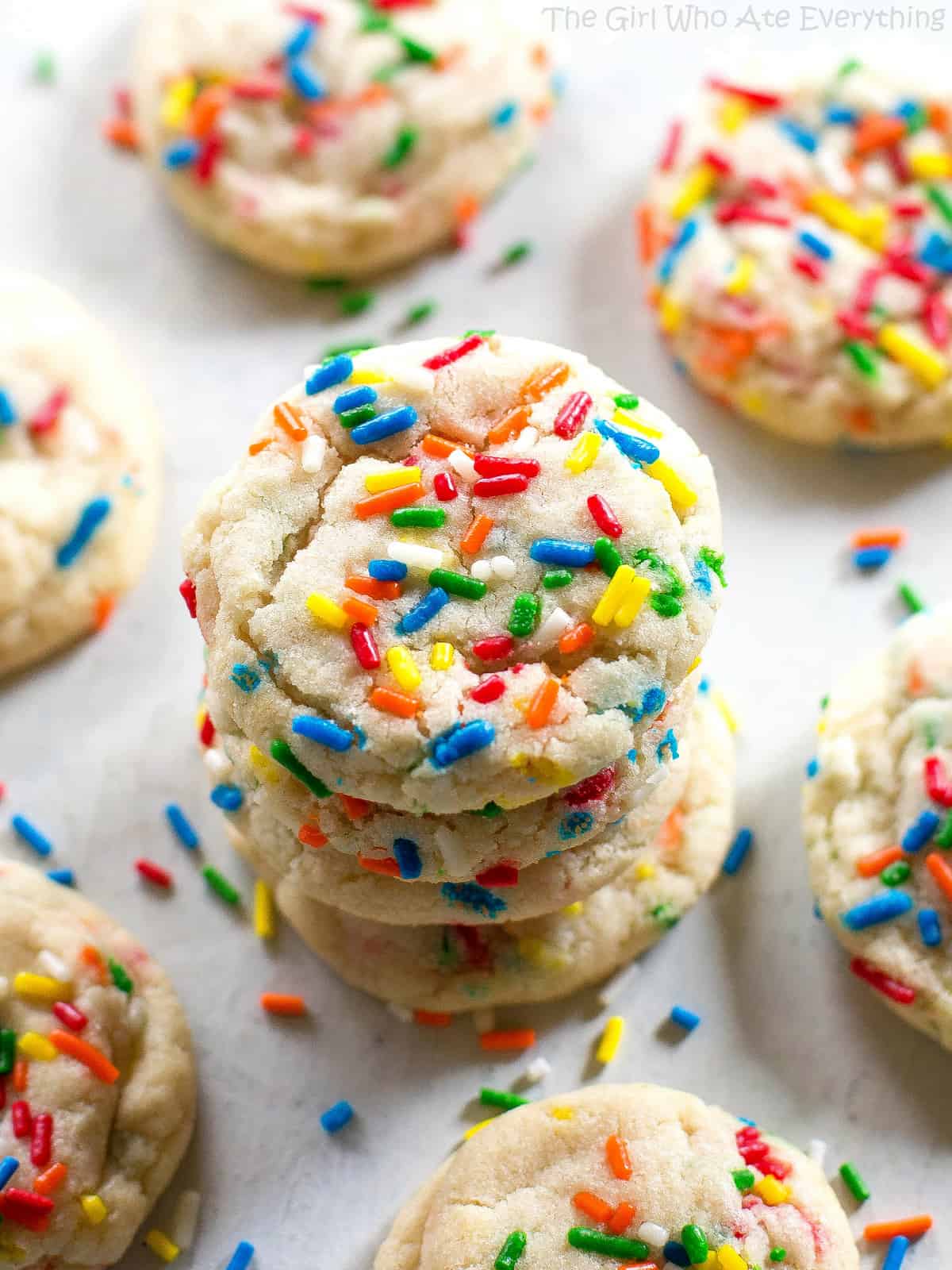
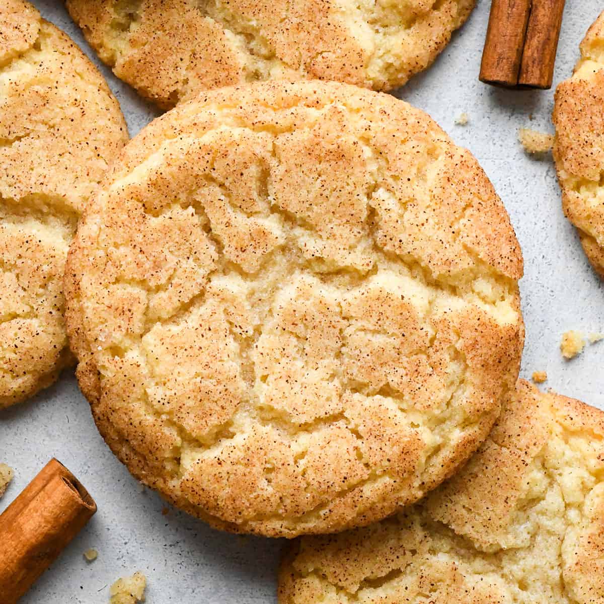
I will be using a classic sugar cookie recipe with apple sauce as an egg replacement. I have made this recipe a couple times and want to use the photos to potentially make vector illustrations of the cookies.
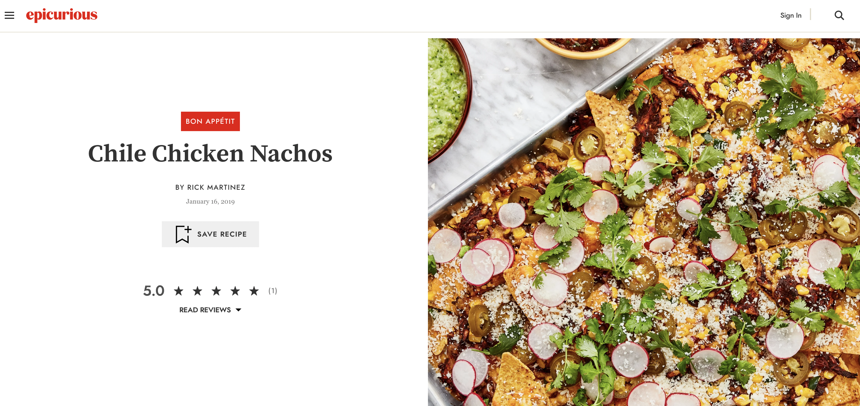
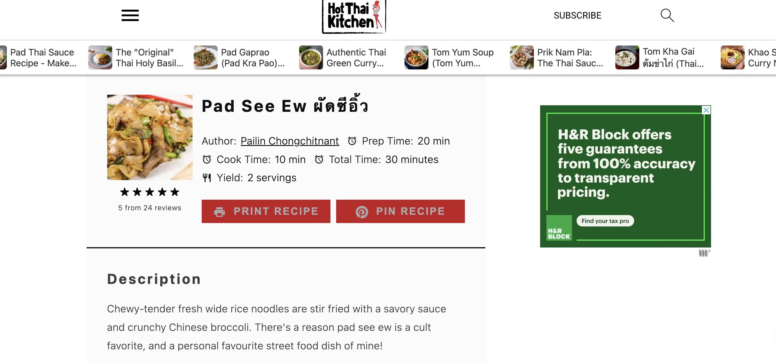
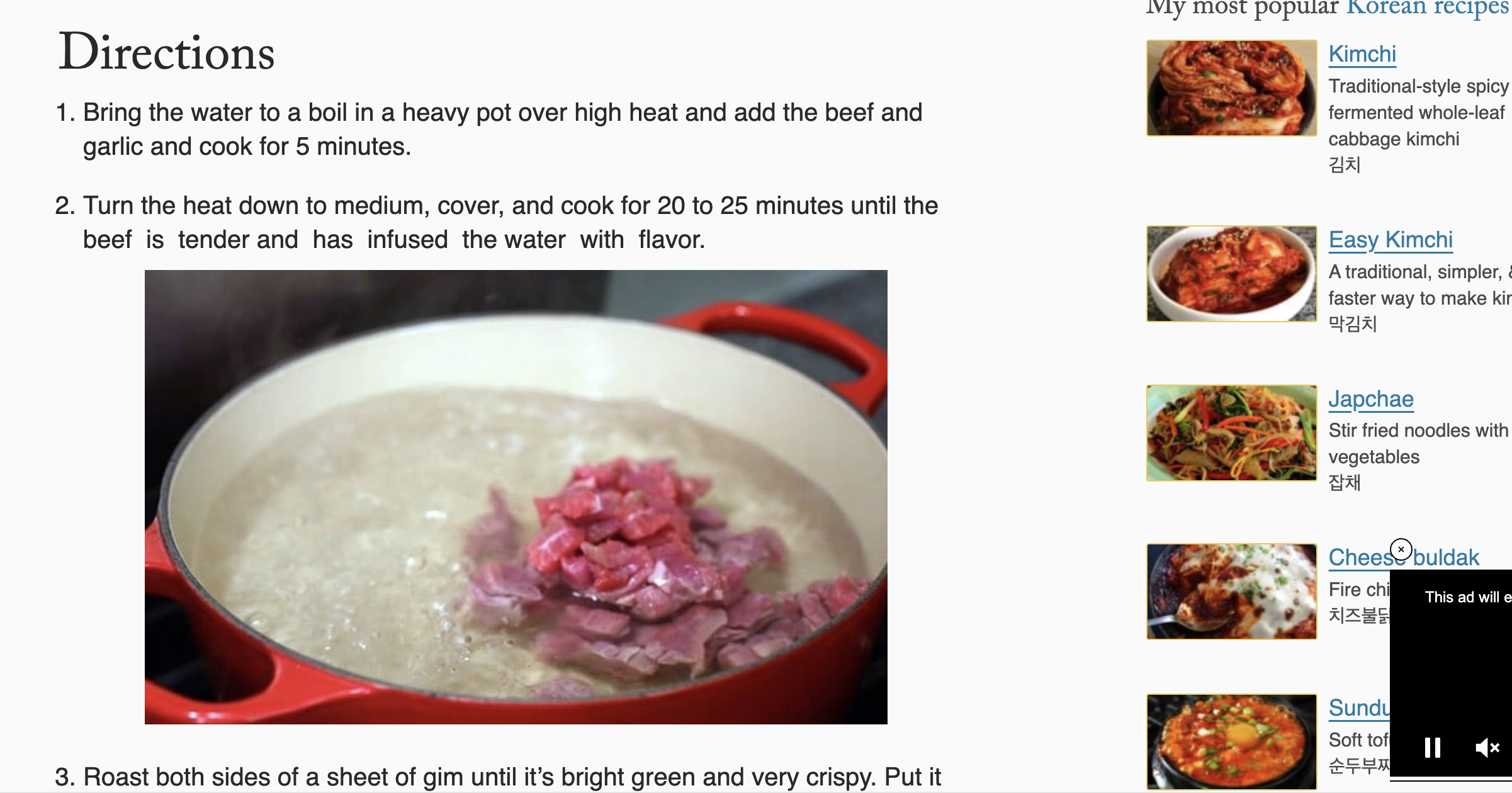
The image, title, and difficulty are featured above the fold, making it easier to understand what the recipe is for. Smaller creaters tend to have long introductions that make it difficult to find the actual instructions.
I like the idea of including more recipes on the top as a floating bar. I also liked the clean, minimalist color palette.
I like the two-column approach to include more information in the same amount of space. The website was a little messy and the color palette was a bit overwhelming, but I like how the splash features a video of the instructions for more visual
The color palette on Swab the World's website is simple, clean, and colorful. The scroll animations are very seamless and not overwhelming.
I like the simplistic image treatments, and the fact that the scroll makes it so that only one thing can be on the screen at a time. This could be useful when illustrating different steps of the recipe.
The simple vector illustrations and color palette make the page look visually clean with high contrast. The flag pole progress bar is also a unique touch.